

CASE STUDY 02 — UX RESEARCH + CONCEPT
Caravan Records.
From a record-shop website to a discovery destination.
Role
Solo UX Designer (research, synthesis, IA, concepting, wireframes & prototype)
Client
Caravan — independent London record boutique
Scope
Concept redesign of e-commerce — Home, PLP, PDP
Timeline
8 weeks, part-time
Status
Concept / interactive prototype (Conceptual work, not implemented)
TL;DR
Summary
Caravan were seeking for a UI polish on three pages of their webshop. Eight weeks later I'd reframed the brief: the website's real problem wasn't (only) usability, it was purpose. Buyers go to global marketplaces like Discogs for rarities, and to their regular shops for new releases — Caravan's online store didn't have a strong position among those consumer options.
I ran 6 moderated usability tests across two recruit groups, benchmarked the site against 8+ competitors, and made a strategic case: Caravan should compete on discovery and curation, not catalogue size. I prototyped a discovery-first storefront — editorial-led home, curated PLP with editorial banners between listings, a clearer PDP — and tested it through mid- and hi-fi rounds.
CONTENTS
01 Brief & scope
02 Process
03 Discovery — what users showed me
04 Competitive analysis
05 Synthesis
06 Ideation & concept direction
07 The work
08 What I'd do next
09 Reflections
01
—
SECTION
Brief & scope
Caravan is an independent London record shop selling second-hand vinyl, Japanese editions and rare Japanese books. The business runs through three channels — pop-up shop, market stalls, and webshop — with a meaningful share of online revenue routed through Discogs / eBay and search traffic for rare books.
The scope I was given covered the three pages most load-bearing for purchase:

Home — orient visitors to Caravan's mission and steer them towards desired products.
Product Listing Page (PLP) — multi-product browsing and filtering.
Product Detail Page (PDP) — product evaluation, reviews, purchase confidence.
The implicit assumption in the brief was that the existing site was usable but unrefined. Early testing flipped that assumption.
02
—
SECTION
Process
I worked the project through a full UX cycle — discovery, synthesis, ideation, design — using these methods:
Moderated usability tests with screen + video recording.
Stakeholder + buyer interviews alongside the tests.
Competitive benchmarking and feature inventory across 8 record retailers.
Heuristic review of the live site.
Task analysis of the existing purchase flow.
Card sort as an IA sense-check before wireframing.
03
—
SECTION
Discovery — what users showed me
Recruitment
Six participants in two groups: 4 regular vinyl buyers (online + offline), and 2 with interest in music but who rarely shop for it (modelling gift-buying and lapsed users).
What I observed
The usability issues were real and predictable:
A lot of sold-out items still listed in the catalogue.
Almost no filtering — genre, format, condition, price all unsearchable.
Two competing navigation panels and a hero image eating the entire fold.
Account / wishlist UI advertised but non-functional.
No audio clips on most listings, no description on many.
The strategic insight
Across both groups, almost no one came online to "browse and see what comes up." They came with intent — and that intent split cleanly: for new records → trusted shops; for rare or second-hand records → Discogs or eBay. That left Caravan competing for a search occasion that mostly didn't exist.
Why would anyone come back to caravan-records.com?
This became the project's pivot point. The brief was no longer "fix the three pages." It was "find Caravan's role online."
04
—
SECTION
Competitive analysis
I benchmarked Caravan against four cohorts: one-person independents, established second-hand sellers, larger online vinyl retailers, and newer shops with experimental experiences. Comparison covered shipping/returns clarity, rare and used inventory handling, genre filtering, editorial content, account features, brand and community integration, and discovery / curation features.
What it revealed
Caravan's gap wasn't only technical hygiene — it was experience differentiation. The retailers earning return visits, even without the deepest catalogue, all leaned on the same things:
Stronger discovery mechanisms (curated lists, mixes, editorials).
Better curation framing — the shop has a point of view, not just inventory.
Clear trust signals (shipping, condition grading, support).
Bridges between the physical and online experience.
The brick-and-mortar trade has known this for decades. Physical record shops sell discovery — the staff pick, the in-store mix, the conversation. Most webshops drop all of that the moment you go online. The shops that don't are the ones earning return visits.
05
—
SECTION
Synthesis
Two strategic directions came out of the research, and I argued for pursuing both — but with the second leading the design.
Fix the confidence blockers — clearer navigation, working filters, richer product evaluation.
Position Caravan as the place to discover the records you didn't know you needed.
Problem statement
Shoppers struggle to find and evaluate items due to unclear navigation, limited filtering, and minimal product info — causing hesitation and lower purchase confidence. Beneath that, the site has no clear reason for existing alongside trusted shops and Discogs.
Design question
How might we make it easy for a user to discover records they didn't come looking for?
06
—
SECTION
Ideation & concept direction
I ran an ideation pass on discovery-oriented concepts and pressure-tested them against Caravan's identity, operational realities, and the competitive gap. The strongest ideas were editorial and curatorial — exactly the area where Caravan was outflanked by competitors, and exactly the area that fit their existing voice.
Experience principles
Editorial-led discovery — generous space for curated content.
Community signals — in-store mixes and culture content woven into shopping surfaces.
Trust & guidance — clearer USPs, shipping and support information up front.
Better orientation — breadcrumbs, stronger navigation cues, single nav pattern.
07
—
SECTION
The work
Wireframes — mid-fidelity
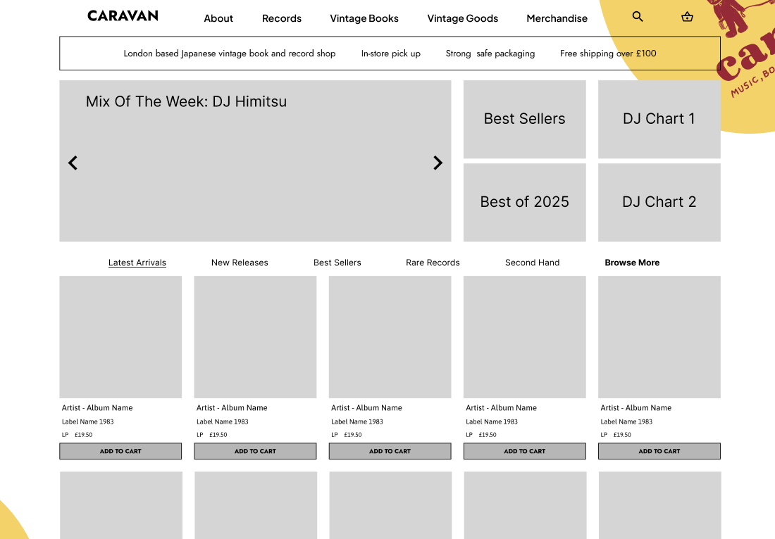
The wireframes operationalised the principles across three pages: Home with a USP bar above the fold and editorial banners taking deliberately large real estate; PLP with editorial banners interleaved with listings (the discovery principle made structural, not decorative) and a real filter section; PDP reorganised around audio player → images → description → genres.
Scroll screenshot horizontally.
Mid-fi testing
Encouraging signal: the cleaner layout landed, the editorial framing didn't confuse buyers. The most consistent feedback was typography and spacing — fonts felt tight, gutters felt cramped.
Hi-fi — moodboard & visual decisions
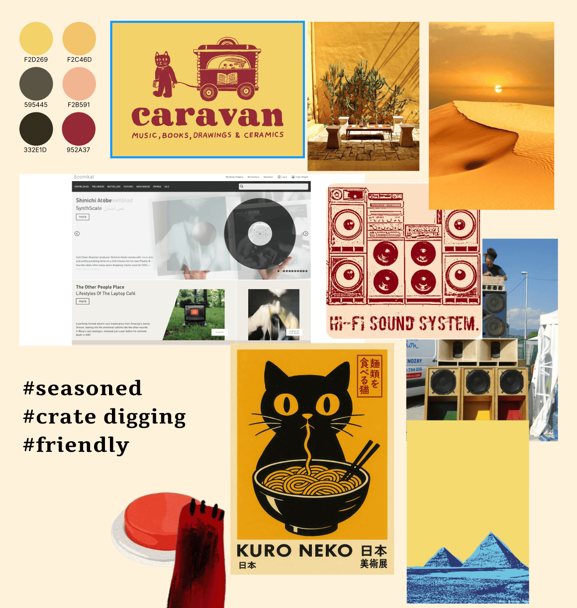
Moodboard built around the new brand mark and two of the shop owner's recurring motifs — cats and pyramids. Typographic pairing: Plus Jakarta Sans (modern, neutral) with Tienne (a warm serif), aiming for contemporary feel with a hint of editorial weight.
Hi-fi — iterations
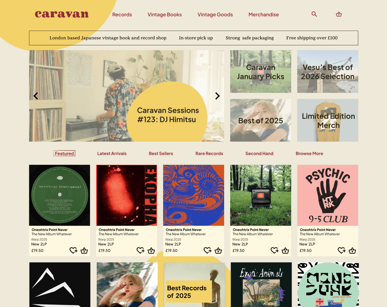
First iteration: warm but neutral background, branding elements in header, large editorial banners. Functional but visually safe. Final iteration: warmer, sandy background colour pulled from the brand palette. Footer redesigned to carry brand atmosphere. Removed repetitive Add to Cart buttons from listings — they over-pushed conversion at the cost of browse-mode calm.
Hi-fi testing
A second testing round on the near-final prototype surfaced a clear list to action: more breathing room (gutters, columns); type pairing flagged for review; CTA spacing fixes; card layout fine-tuning.
08
—
SECTION
What I'd do next
Stakeholder alignment on the strategic direction — the editorial / mix-series proposition costs editorial labour. The shop owner needs to choose between guest mixes, written editorials, or a net-radio-style channel.
Concept testing with a wider sample to validate that the editorial framing actually drives return visits, not just first-visit goodwill.
Design the surfaces I scoped out — mixes, editorial articles, curated lists — and connect them back to product discovery loops.
Simplify visual density further — fewer cards per row, bigger type, more space.
09
—
SECTION
Reflections
The lesson I took from this project — and the one I lead with for clients now — is that a usability brief is sometimes a strategy brief in disguise. Three pages of UI polish wouldn't have moved the needle for Caravan, because the underlying issue was positioning, not interface. The work that mattered was identifying that gap, making the case for a different scope, and showing through design what the answer could look like.
While Caravan loved the re-design, they didn't ship it due to lack of resources. The artefact that remains is the case for what their online presence could be — and a prototype that shows what it would feel like.
NEXT CASE STUDY
Voices Radio.
From a static homepage to a community-first listening experience.
Read the next case study
→
CASE STUDY 02 — UX RESEARCH + CONCEPT
Caravan Records.
From a record-shop website to a discovery destination.
Role
Solo UX Designer (research, synthesis, IA, concepting, wireframes & prototype)
Client
Caravan — independent London record boutique
Scope
Concept redesign of e-commerce — Home, PLP, PDP
Timeline
8 weeks, part-time
Status
Concept / interactive prototype (Conceptual work, not implemented)
TL;DR
Summary
Caravan were seeking for a UI polish on three pages of their webshop. Eight weeks later I'd reframed the brief: the website's real problem wasn't (only) usability, it was purpose. Buyers go to global marketplaces like Discogs for rarities, and to their regular shops for new releases — Caravan's online store didn't have a strong position among those consumer options.
I ran 6 moderated usability tests across two recruit groups, benchmarked the site against 8+ competitors, and made a strategic case: Caravan should compete on discovery and curation, not catalogue size. I prototyped a discovery-first storefront — editorial-led home, curated PLP with editorial banners between listings, a clearer PDP — and tested it through mid- and hi-fi rounds.
CONTENTS
01 Brief & scope
02 Process
03 Discovery — what users showed me
04 Competitive analysis
05 Synthesis
06 Ideation & concept direction
07 The work
08 What I'd do next
09 Reflections
01
—
SECTION
Brief & scope
Caravan is an independent London record shop selling second-hand vinyl, Japanese editions and rare Japanese books. The business runs through three channels — pop-up shop, market stalls, and webshop — with a meaningful share of online revenue routed through Discogs / eBay and search traffic for rare books.
The scope I was given covered the three pages most load-bearing for purchase:
Home — orient visitors to Caravan's mission and steer them towards desired products.
Product Listing Page (PLP) — multi-product browsing and filtering.
Product Detail Page (PDP) — product evaluation, reviews, purchase confidence.
The implicit assumption in the brief was that the existing site was usable but unrefined. Early testing flipped that assumption.
02
—
SECTION
Process
I worked the project through a full UX cycle — discovery, synthesis, ideation, design — using these methods:
Moderated usability tests with screen + video recording.
Stakeholder + buyer interviews alongside the tests.
Competitive benchmarking and feature inventory across 8 record retailers.
Heuristic review of the live site.
Task analysis of the existing purchase flow.
Card sort as an IA sense-check before wireframing.
03
—
SECTION
Discovery — what users showed me
Recruitment
Six participants in two groups: 4 regular vinyl buyers (online + offline), and 2 with interest in music but who rarely shop for it (modelling gift-buying and lapsed users).
What I observed
The usability issues were real and predictable:
A lot of sold-out items still listed in the catalogue.
Almost no filtering — genre, format, condition, price all unsearchable.
Two competing navigation panels and a hero image eating the entire fold.
Account / wishlist UI advertised but non-functional.
No audio clips on most listings, no description on many.
The strategic insight
Across both groups, almost no one came online to "browse and see what comes up." They came with intent — and that intent split cleanly: for new records → trusted shops; for rare or second-hand records → Discogs or eBay. That left Caravan competing for a search occasion that mostly didn't exist.
Why would anyone come back to caravan-records.com?
This became the project's pivot point. The brief was no longer "fix the three pages." It was "find Caravan's role online."
04
—
SECTION
Competitive analysis
I benchmarked Caravan against four cohorts: one-person independents, established second-hand sellers, larger online vinyl retailers, and newer shops with experimental experiences. Comparison covered shipping/returns clarity, rare and used inventory handling, genre filtering, editorial content, account features, brand and community integration, and discovery / curation features.
What it revealed
Caravan's gap wasn't only technical hygiene — it was experience differentiation. The retailers earning return visits, even without the deepest catalogue, all leaned on the same things:
Stronger discovery mechanisms (curated lists, mixes, editorials).
Better curation framing — the shop has a point of view, not just inventory.
Clear trust signals (shipping, condition grading, support).
Bridges between the physical and online experience.
The brick-and-mortar trade has known this for decades. Physical record shops sell discovery — the staff pick, the in-store mix, the conversation. Most webshops drop all of that the moment you go online. The shops that don't are the ones earning return visits.
05
—
SECTION
Synthesis
Two strategic directions came out of the research, and I argued for pursuing both — but with the second leading the design.
Fix the confidence blockers — clearer navigation, working filters, richer product evaluation.
Position Caravan as the place to discover the records you didn't know you needed.
Problem statement
Shoppers struggle to find and evaluate items due to unclear navigation, limited filtering, and minimal product info — causing hesitation and lower purchase confidence. Beneath that, the site has no clear reason for existing alongside trusted shops and Discogs.
Design question
How might we make it easy for a user to discover records they didn't come looking for?
06
—
SECTION
Ideation & concept direction
I ran an ideation pass on discovery-oriented concepts and pressure-tested them against Caravan's identity, operational realities, and the competitive gap. The strongest ideas were editorial and curatorial — exactly the area where Caravan was outflanked by competitors, and exactly the area that fit their existing voice.
Experience principles
Editorial-led discovery — generous space for curated content.
Community signals — in-store mixes and culture content woven into shopping surfaces.
Trust & guidance — clearer USPs, shipping and support information up front.
Better orientation — breadcrumbs, stronger navigation cues, single nav pattern.
07
—
SECTION
The work
Wireframes — mid-fidelity
The wireframes operationalised the principles across three pages: Home with a USP bar above the fold and editorial banners taking deliberately large real estate; PLP with editorial banners interleaved with listings (the discovery principle made structural, not decorative) and a real filter section; PDP reorganised around audio player → images → description → genres.
Mid-fi testing
Encouraging signal: the cleaner layout landed, the editorial framing didn't confuse buyers. The most consistent feedback was typography and spacing — fonts felt tight, gutters felt cramped.
Hi-fi — moodboard & visual decisions
Moodboard built around the new brand mark and two of the shop owner's recurring motifs — cats and pyramids. Typographic pairing: Plus Jakarta Sans (modern, neutral) with Tienne (a warm serif), aiming for contemporary feel with a hint of editorial weight.
Hi-fi — iterations
First iteration: warm but neutral background, branding elements in header, large editorial banners. Functional but visually safe. Final iteration: warmer, sandy background colour pulled from the brand palette. Footer redesigned to carry brand atmosphere. Removed repetitive Add to Cart buttons from listings — they over-pushed conversion at the cost of browse-mode calm.
Hi-fi testing
A second testing round on the near-final prototype surfaced a clear list to action: more breathing room (gutters, columns); type pairing flagged for review; CTA spacing fixes; card layout fine-tuning.
08
—
SECTION
What I'd do next
Stakeholder alignment on the strategic direction — the editorial / mix-series proposition costs editorial labour. The shop owner needs to choose between guest mixes, written editorials, or a net-radio-style channel.
Concept testing with a wider sample to validate that the editorial framing actually drives return visits, not just first-visit goodwill.
Design the surfaces I scoped out — mixes, editorial articles, curated lists — and connect them back to product discovery loops.
Simplify visual density further — fewer cards per row, bigger type, more space.
09
—
SECTION
Reflections
The lesson I took from this project — and the one I lead with for clients now — is that a usability brief is sometimes a strategy brief in disguise. Three pages of UI polish wouldn't have moved the needle for Caravan, because the underlying issue was positioning, not interface. The work that mattered was identifying that gap, making the case for a different scope, and showing through design what the answer could look like.
While Caravan loved the re-design, they didn't ship it due to lack of resources. The artefact that remains is the case for what their online presence could be — and a prototype that shows what it would feel like.
NEXT CASE STUDY
Voices Radio.
From a static homepage to a community-first listening experience.
Read the next case study
→
CASE STUDY 02 — UX RESEARCH + CONCEPT
Caravan Records.
From a record-shop website to a discovery destination.
Role
Solo UX Designer (research, synthesis, IA, concepting, wireframes & prototype)
Client
Caravan — independent London record boutique
Scope
Concept redesign of e-commerce — Home, PLP, PDP
Timeline
8 weeks, part-time
Status
Concept / interactive prototype (Conceptual work, not implemented)
TL;DR
Summary
Caravan were seeking for a UI polish on three pages of their webshop. Eight weeks later I'd reframed the brief: the website's real problem wasn't (only) usability, it was purpose. Buyers go to global marketplaces like Discogs for rarities, and to their regular shops for new releases — Caravan's online store didn't have a strong position among those consumer options.
I ran 6 moderated usability tests across two recruit groups, benchmarked the site against 8+ competitors, and made a strategic case: Caravan should compete on discovery and curation, not catalogue size. I prototyped a discovery-first storefront — editorial-led home, curated PLP with editorial banners between listings, a clearer PDP — and tested it through mid- and hi-fi rounds.
CONTENTS
01 Brief & scope
02 Process
03 Discovery — what users showed me
04 Competitive analysis
05 Synthesis
06 Ideation & concept direction
07 The work
08 What I'd do next
09 Reflections
01
—
SECTION
Brief & scope
Caravan is an independent London record shop selling second-hand vinyl, Japanese editions and rare Japanese books. The business runs through three channels — pop-up shop, market stalls, and webshop — with a meaningful share of online revenue routed through Discogs / eBay and search traffic for rare books.
The scope I was given covered the three pages most load-bearing for purchase:
Home — orient visitors to Caravan's mission and steer them towards desired products.
Product Listing Page (PLP) — multi-product browsing and filtering.
Product Detail Page (PDP) — product evaluation, reviews, purchase confidence.
The implicit assumption in the brief was that the existing site was usable but unrefined. Early testing flipped that assumption.
02
—
SECTION
Process
I worked the project through a full UX cycle — discovery, synthesis, ideation, design — using these methods:
Moderated usability tests with screen + video recording.
Stakeholder + buyer interviews alongside the tests.
Competitive benchmarking and feature inventory across 8 record retailers.
Heuristic review of the live site.
Task analysis of the existing purchase flow.
Card sort as an IA sense-check before wireframing.
03
—
SECTION
Discovery — what users showed me
Recruitment
Six participants in two groups: 4 regular vinyl buyers (online + offline), and 2 with interest in music but who rarely shop for it (modelling gift-buying and lapsed users).
What I observed
The usability issues were real and predictable:
A lot of sold-out items still listed in the catalogue.
Almost no filtering — genre, format, condition, price all unsearchable.
Two competing navigation panels and a hero image eating the entire fold.
Account / wishlist UI advertised but non-functional.
No audio clips on most listings, no description on many.
The strategic insight
Across both groups, almost no one came online to "browse and see what comes up." They came with intent — and that intent split cleanly: for new records → trusted shops; for rare or second-hand records → Discogs or eBay. That left Caravan competing for a search occasion that mostly didn't exist.
Why would anyone come back to caravan-records.com?
This became the project's pivot point. The brief was no longer "fix the three pages." It was "find Caravan's role online."
04
—
SECTION
Competitive analysis
I benchmarked Caravan against four cohorts: one-person independents, established second-hand sellers, larger online vinyl retailers, and newer shops with experimental experiences. Comparison covered shipping/returns clarity, rare and used inventory handling, genre filtering, editorial content, account features, brand and community integration, and discovery / curation features.
What it revealed
Caravan's gap wasn't only technical hygiene — it was experience differentiation. The retailers earning return visits, even without the deepest catalogue, all leaned on the same things:
Stronger discovery mechanisms (curated lists, mixes, editorials).
Better curation framing — the shop has a point of view, not just inventory.
Clear trust signals (shipping, condition grading, support).
Bridges between the physical and online experience.
The brick-and-mortar trade has known this for decades. Physical record shops sell discovery — the staff pick, the in-store mix, the conversation. Most webshops drop all of that the moment you go online. The shops that don't are the ones earning return visits.
05
—
SECTION
Synthesis
Two strategic directions came out of the research, and I argued for pursuing both — but with the second leading the design.
Fix the confidence blockers — clearer navigation, working filters, richer product evaluation.
Position Caravan as the place to discover the records you didn't know you needed.
Problem statement
Shoppers struggle to find and evaluate items due to unclear navigation, limited filtering, and minimal product info — causing hesitation and lower purchase confidence. Beneath that, the site has no clear reason for existing alongside trusted shops and Discogs.
Design question
How might we make it easy for a user to discover records they didn't come looking for?
06
—
SECTION
Ideation & concept direction
I ran an ideation pass on discovery-oriented concepts and pressure-tested them against Caravan's identity, operational realities, and the competitive gap. The strongest ideas were editorial and curatorial — exactly the area where Caravan was outflanked by competitors, and exactly the area that fit their existing voice.
Experience principles
Editorial-led discovery — generous space for curated content.
Community signals — in-store mixes and culture content woven into shopping surfaces.
Trust & guidance — clearer USPs, shipping and support information up front.
Better orientation — breadcrumbs, stronger navigation cues, single nav pattern.
07
—
SECTION
The work
Wireframes — mid-fidelity
The wireframes operationalised the principles across three pages: Home with a USP bar above the fold and editorial banners taking deliberately large real estate; PLP with editorial banners interleaved with listings (the discovery principle made structural, not decorative) and a real filter section; PDP reorganised around audio player → images → description → genres.
Mid-fi testing
Encouraging signal: the cleaner layout landed, the editorial framing didn't confuse buyers. The most consistent feedback was typography and spacing — fonts felt tight, gutters felt cramped.
Hi-fi — moodboard & visual decisions
Moodboard built around the new brand mark and two of the shop owner's recurring motifs — cats and pyramids. Typographic pairing: Plus Jakarta Sans (modern, neutral) with Tienne (a warm serif), aiming for contemporary feel with a hint of editorial weight.
Hi-fi — iterations
First iteration: warm but neutral background, branding elements in header, large editorial banners. Functional but visually safe. Final iteration: warmer, sandy background colour pulled from the brand palette. Footer redesigned to carry brand atmosphere. Removed repetitive Add to Cart buttons from listings — they over-pushed conversion at the cost of browse-mode calm.
Hi-fi testing
A second testing round on the near-final prototype surfaced a clear list to action: more breathing room (gutters, columns); type pairing flagged for review; CTA spacing fixes; card layout fine-tuning.
08
—
SECTION
What I'd do next
Stakeholder alignment on the strategic direction — the editorial / mix-series proposition costs editorial labour. The shop owner needs to choose between guest mixes, written editorials, or a net-radio-style channel.
Concept testing with a wider sample to validate that the editorial framing actually drives return visits, not just first-visit goodwill.
Design the surfaces I scoped out — mixes, editorial articles, curated lists — and connect them back to product discovery loops.
Simplify visual density further — fewer cards per row, bigger type, more space.
09
—
SECTION
Reflections
The lesson I took from this project — and the one I lead with for clients now — is that a usability brief is sometimes a strategy brief in disguise. Three pages of UI polish wouldn't have moved the needle for Caravan, because the underlying issue was positioning, not interface. The work that mattered was identifying that gap, making the case for a different scope, and showing through design what the answer could look like.
While Caravan loved the re-design, they didn't ship it due to lack of resources. The artefact that remains is the case for what their online presence could be — and a prototype that shows what it would feel like.
NEXT CASE STUDY
Voices Radio.
From a static homepage to a community-first listening experience.
Read the next case study
→